8.29.2011

Loving: Bedside Art

Several months back, my friend Jamie asked for my advice on how to decorate her guest bedroom, which features an antique bed with a high, ornate headboard.  In tracking down inspiration, what kept catching my eye was bedside artwork -- art on or just above bedside tables.  You can check out my Pinterest board dedicated to the subject here.  Bedside artwork is usually paired with high, ornate headboards, four-poster beds, or something simple like a mirror hanging over the bed.  Here are some of my favorites:
Bedside Artwork

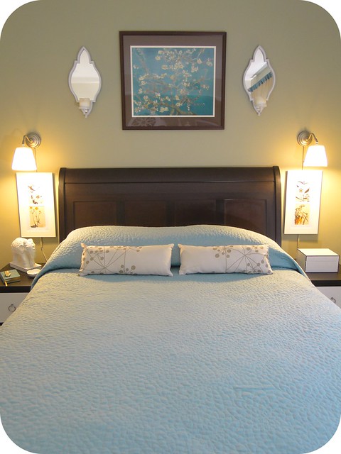
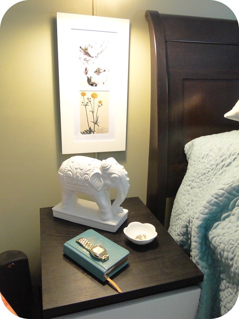
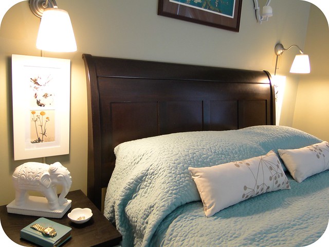
Despite these "rules" of bedside art, I declared, "It shall be mine!"  Plus I thought it would be a good way to hide the cords to our bedside lights.  And, an extra bonus...it is a way to add interest to our bedside tables that is impervious to 3am feline interference (i.e. swat, swat, crash). 

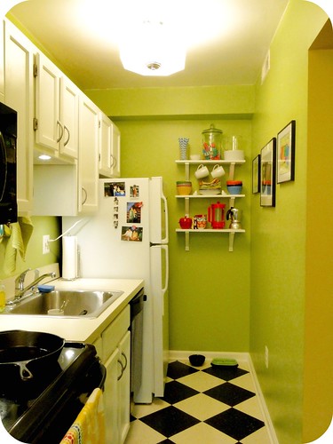
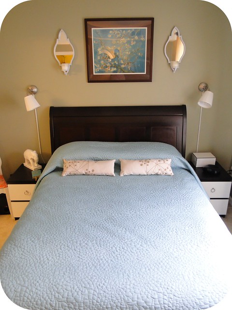
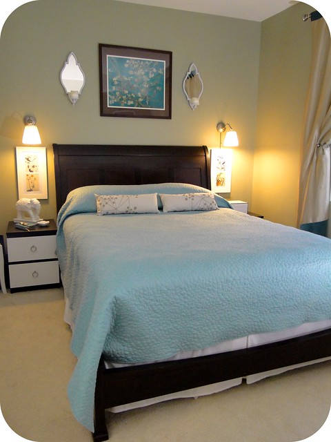
So, here we are sans-artwork:
DSC02113
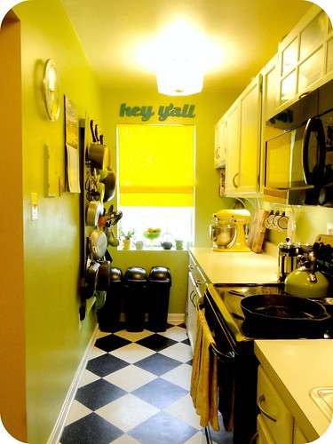
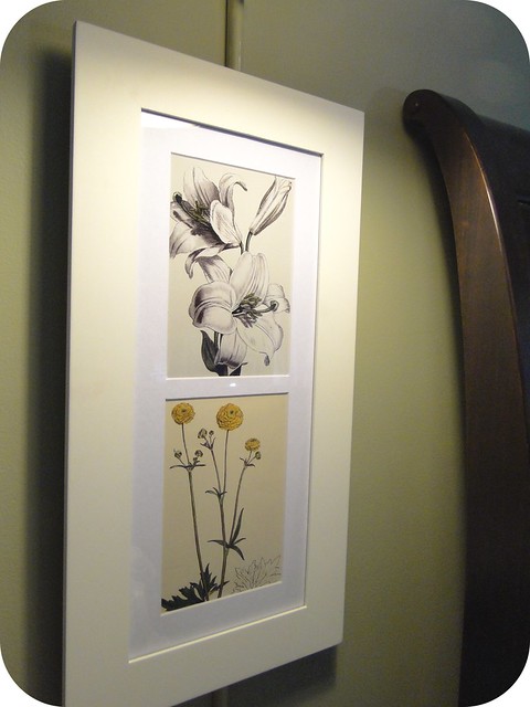
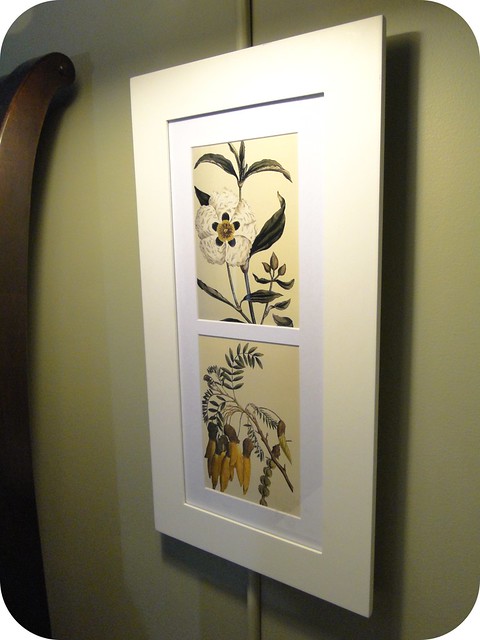
A trip to Marshall's scored me two absolutely perfect long, narrow white frames at $5.99 each.  Seriously.  Score.  And then some free, print-at-home artwork thanks to The Botanical Magazine, available for free here.  Despite not following the "rules" on this one, I'm a fan...
Bedside Art 1
Bedside Art 2
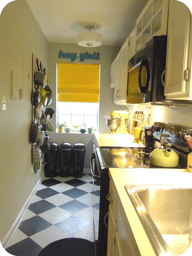
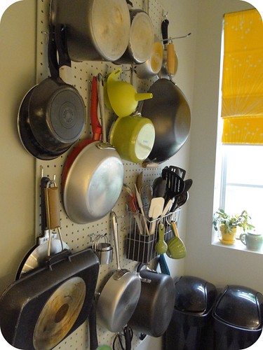
You'll notice I got rid of my gallery wall by the window to cut down on the busyness of too much artwork.
Bedside Art 3
Bedside Art 4Bedside Art 5
Bedside Art 6
Signature
-----

8.28.2011

New in the Etsy Shop

More color block purses!  I think I have a problem...

New Purses
Signature
-----

8.24.2011

Classin' Up the Kitchen

Last weekend, Michael went out of town for -- get this -- a bachelor weekend-of-sorts for his friend who is about to have a baby (yeah, I know, don't even get me started on how ridiculous this concept is).  While he was away, I did a change up in the kitchen.  Michael fears change and has very little tolerance for disarray (which is not to say that he is super neat).  I figured the best way for a kitchen paint job to go down was to just make it happen in his absense such that he neither had to see the change take place nor experience the mess necessary to get the deed done.

I'd been considering a paint change for quite some time now.  Don't get me wrong, I loved the green, but there was always something about it that made it feel a bit juvenile -- even garish -- to me.  Maybe because of the shear fact that it photographed so horribly.  The glossy finish wasn't really doing it any favors, either.

51

After much consideration and pinning, I landed on grey.  It's admittedly a departure from the bright color we had lived with for nearly 4 years now, but the time was right.  And I thought it might make all my colorful kitchenware stand out all the more.  Here's some of my inspiration (you can check out more inspiration and the other options I considered -- including Grey, Blue, and Green -- on Pinterest):

Grey Kitchens
Clockwise from Top Right: Source, Source, Source, Source

I ended up going with Rhino from Behr, and I've got to say...I am completely in love.  I also went with a flat paint this time around, and I think it made a huge difference.  The walls look so much smoother -- almost velvety.  I get that they're less stain resistent, but I don't mind a touch up every now and then.  And finally, I went with the paint + primer in one, and it was ah-mazing.  Seriously, one coat and done. 
New Grey KitchenNew Grey KitchenDSC02432New Grey KitchenNew Grey KitchenNew Grey KitchenNew Grey KitchenNew Grey Kitchen

Signature
-----

8.18.2011

Pascoe Plywood Chairs: Before and After(ish)

About a month ago, my friend Alex picked up a set of mid-century Pascoe plywood chairs.  My understanding (which is garnered exclusively from this blog post, which actually features the very pair of chairs that Alex bought off Craigslist) is that these chairs were sold in the 1950s as knock-offs of a similar chair by Paul McCobb.  In any event, they are considered a score these days, and for whatever reason, Alex entrusted their sad, naked little seats with me.

BEFORE
Plywood Chairs - BEFORE

Alex wanted them recovered in a rich burgundy leather, and he wanted to keep it low profile.  While recovering a seat is easy-peasy--a mere matter of spray adhesive and staples, I was a little intimidated by the prospect of both (#1) procuring leather at a reasonable price and (#2) working with leather such that I preserved the lines of the chair's seat.  My saviors were (#1) E-bay and (#2) staples, staples, staples!

I was able to pick up a nice piece of remnant burgundy hide from an E-bay seller for $25 with shipping (!), and it was just enough to cover both seats.

Plywood Chairs - During 1

Once I'd affixed a couple of layers of low loft batting cut to fit only the top of the seat (i.e. not wrap around) with spray adhesive, I pulled, pushed, wrapped, and stapled the leather into complete and utter submission.

Plywood Chairs - Staples 1

I was admittedly a little reticent at putting so many staples into a project like this, but my mind was put more at ease by the presence of many a staple hole already in the bottom of both seats from a previous cover job.  And I'm pretty sure that leather's not going anywhere for a while.

Plywood Chairs - Staples 2

And with that, I was able to produce a nice, low-profile after(ish).  Alex plans to get the wood on the backrests refinished as well, so I'm excited to see the true after.

AFTER
Plywood Chairs - AFTER
Plywood Chairs - AFTER 2

Side-by-Side
Plywood Chairs - BEFOREPlywood Chairs - AFTER


Signature
-----

8.10.2011

Fabric Paper Glue $25 Giveaway @ Thrifty and Fabulous

Love my new purses?  Adore my houndstooth pillows?  Covet my invitations?  Well, even if you don't, you should head over to Thrifty and Fabulous to win a $25 credit to my Etsy shop and check out some of Erika's adorable projects and money-saving tips.  It closes Friday, so do it...stat.


Signature
-----


8.09.2011

New in the Shop: Rethinking My Aesthetic (or "I Love the 80s")

I wouldn't necessarily say that my Etsy shop has been unsuccessful, but (maybe I shouldn't admit this) I somehow imagined that I would become an overnight sensation with my little pleated clutch purses (in the same way that I used to watch "America's Next Top Model" convinced that I would smile with my eyes and sweep the competition - all 5'2" of me).

Somewhere along the way, I grew tired of these clutches.  Other than the construction, there was no real common thread making them a collection (can you tell that a new season of Project Runway has begun?), and I wasn't even struggling with wanting to keep them for myself (which indicates a problem, right?  I mean, I should want to love the things I create, no?)  Anyway, while I was busy not taking the handmade clutch market by storm, I took some time to rethink my aesthetic and decided that I am lovin' the business out of some 80s colors and color-blocking right now.

While I love the quilting fabrics that grace the facades of my pleated clutch purses, I am loving (if I do say so) these new clutches -- simple, bold, bright, graphic...loud, even.  You should pop over to my shop to check them out.  In the coming weeks, I'll also be working on a whole collection of these that feature neutrals paired with more bold colors, so stay tuned.

CB Group.4
CB6.2
CB7.2
CB8.2
CB4.2
CB5.2
CB1.2
CB3.2
CB2.2
DSC02289

What do you think?  Should you love stuff you try to convince other people to love and buy?

Signature
-----

Pin It button on image hover